There is one page on your website that rises above all others in importance.
Your sales and marketing teams have fought tooth and nail to win the attention of every visitor. Your development team has worked long into the night to deliver an incredibly compelling product.
Yet, if your pricing page isn't perfectly designed to convert potential customers, all that effort is for naught. Close only counts in horse shoes and hand grenades; your pricing page is no exception.
Top 3 pricing page strategies
We've reviewed thousands of pricing pages at Price Intelligently: some great, most mediocre, and a few we'd rather forget. The best pricing pages we've seen have all followed three key design principles around plan structure, value metrics, and clarity.
To help you design a perfect pricing page for your subscription company, we'll take a closer look at each those principles and the pricing pages that successfully put them into practice.
1. One Plan, One Persona
We dedicated two sections of our 140-page eBook on SaaS pricing strategy to quantifying your buyer personas. Your pricing page is where all that labor bears fruit. At a minimum, each of your buyer personas should have three elements:
Buyer personas must include:
- Demographic data: The size and type of your target company along with specific titles, role definitions, and challenges for individuals who work there.
- Valued features: The results from your feature-value analyses. Each buyer persona will value features differently than others.
- Willingness to pay: Price sensitivity data from your market research showing pricing ranges that each buyer persona will pay for their most valued features and/or their positioning on your value metric scale.
If you have effectively conducted your market research, this information can be translated directly onto your pricing page. Each buyer persona can be mapped to a single plan on your pricing page.
Saas Pricing Page Example: Appcues
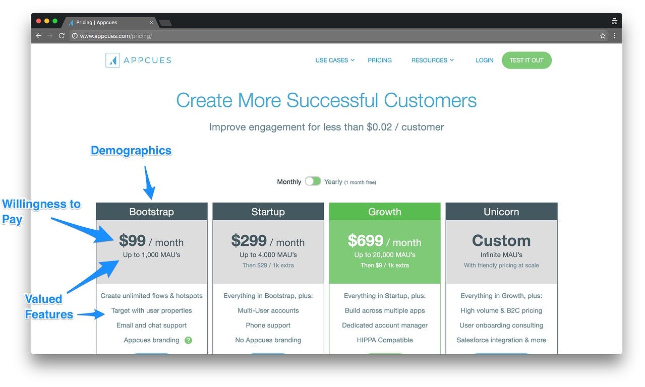
Appcues, a user onboarding tool, has segmented their pricing page by buyer persona. While they've changed their pricing page since this screenshot was taken, it still provides a useful example. Let's break down the lowest tier to see how it meets the "one plan, one persona" principle:
- Demographic data: Bootstrap. "Bootstrap" encompass a number of different demographic traits that are unique to a specific buyer persona. Prospects for this plan will likely be working at very small, unfunded businesses with few customers and are looking to test onboarding and tool tips in their product. The individual purchasing and implementing Appcues is likely to be the CEO. The packaging of this plan clearly signals to potential buyers whether the plan is right for them while cleverly guiding those with different demographic characteristics outside of this category to pricier plans.
- Valued features: 1,000 MAU’s, targeting, Appcues branding. This buyer persona is unlikely to have more than 1,000 monthly active users but strongly values Appcues' flows and targeting. They are willing to sacrifice branding for good value. Appcues' has designed this plan to deliver the feature set demanded by an extremely young company and nothing more.
- Willingness to pay: $99/month. This price is properly segmented: low enough that bootstrapped companies can afford it, yet high enough to reflect the value in the product. This plan acts as an entry point for companies to find value and upgrade into other tiers as they grow.
Each tier is optimized for a particular buyer persona. Whereas the "Bootstrap" tier is targeted at a CEO of a very small startup, the "Growth" and "Unicorn" tiers are optimized for different decision makers like product managers or marketing directors. These personas will place value on different features and are willing to pay more.
Designing plans to target specific personas is necessary to convert those customers, but you'll need to use a value metric to
2. Center Your Pricing Around Your Value Metric
Your value metric is at the heart of the business exchange with your customer. You provide a certain amount of functionality tied to value (like some number of emails, keyword searches, or users) and they pay you in return. With a value-based pricing strategy, the more your customer uses the highest-value part of your product, the more they pay.
You can determine an ideal value metric for your product the same way you determine the rest of your pricing strategy: surveying your customers and collecting data. Once you've found it, you should use it to guide your pricing tier differentiation.
Though each pricing tier can have different features, you should feature your value metric prominently on your pricing page. This is critical for providing a clear path to expansion revenue: every time your customer's usage increases, you have an opportunity to upsell them on a more expensive (and valuable) plan.
SaaS Pricing Page Example: Drift
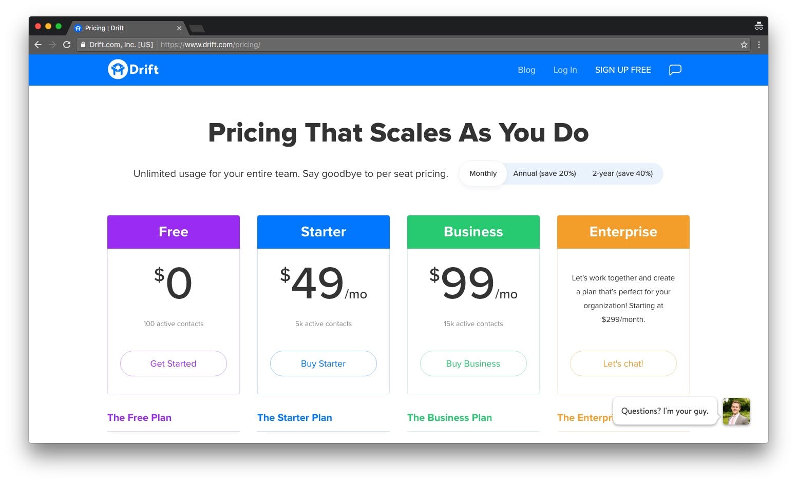
In an older iteration of their pricing page, live-chat messaging tool Drift featured their value metric front and center on their pricing page. All the information about each plan is hidden below the fold. Even the headline of the page, “Pricing That Scales As You Do,” communicates the advantages of a value-based pricing strategy.
Their value metric is “active contacts,” a conversation-focused metric that revolves around Drift’s key value proposition: streamlined customer communication.
Every potential customer that lands on Drift’s pricing page can easily visualize their journey from their first use of the product with a small number of contacts to significant future usage with thousands:
- Free: The customer is just trying Drift out on their site to get a feel with the first few customers. This no-cost freemium option allows Drift customers to fully understand the value proposition.
- Starter: The customer has started to see some early success with live chat. Their site is getting more traffic and they want to continue offering live-chat, so they upgrade to this affordable tier. Drift has converted an unpaid customer to a paid one -- a huge success in SaaS.
- Business: The customer has scaled significantly, partly due to their use of Drift. As the number of active contacts grows (alongside the value of these communications), so does the amount Drift charges.
- Enterprise: Now the customer has reached their highest level of usage. They're talking to tens of thousands of customers each month. They have a much higher willingness to pay because Drift has repeatedly demonstrated its value.
3. Simple, Clear, Easy to Understand
In many areas of design, simplicity is key. While simpler pricing pages are almost always better than complicated ones, it isn’t that, er, simple.
To get people to make an informed decision and sign up for your product with confidence, you have to make sure you are giving them all the information they need to make that informed decision. One of the key findings from SaaS DNA: The Anatomy of a Marketing Site was that, even for tech-savvy customers, SaaS sites could be confusing. If people weren’t able to find the information they needed quickly and clearly, they would leave.
This is even more crucial on the pricing page. This is the point where the potential customer is going to part with their money. Any ambiguity here about what they are going to be getting for that money each month will drastically increase their chances of not signing up.
SaaS Pricing Page Example: Wistia
When you first land on the pricing page of Wistia, a video marketing platform, it looks very clean and simple. In fact, they have simplified the pricing page multiple times in the past few months and years.
But they haven't sacrificed information. Here is the pricing page:
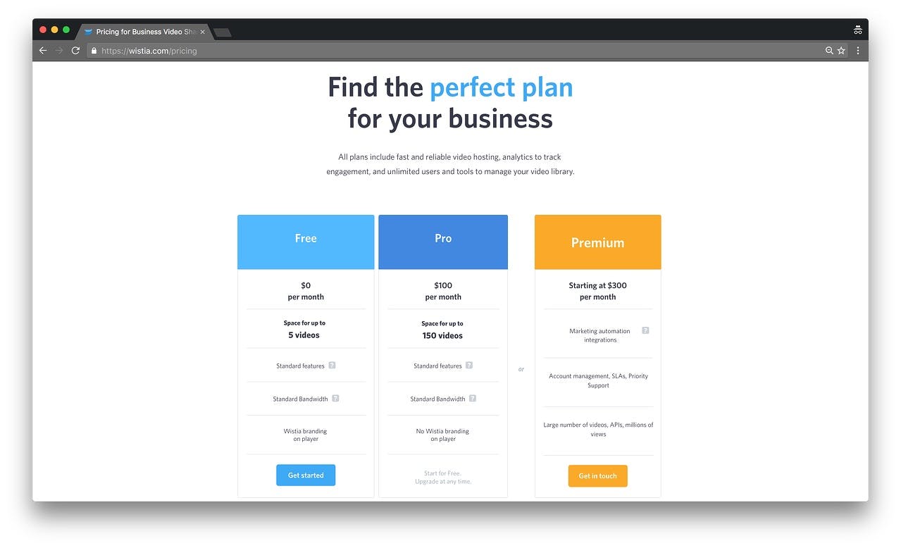
From this pricing page you know:
- The prices for each tier ($0, $100, and $300 per month)
- The main value metric (videos hosted)
- The standard features (video hosting, analytics, unlimited users, video management tools)
- Whether or not you get branding on the player
- The added features available to Premium
- How upgrades work
All of that information is collected on a page that is ~60% whitespace.

You know your business, we know pricing
Price Intelligently's team of monetization experts work with you to combine strategy and data to solve complex business problems and accelerate your growth.
Don’t Forget Pricing Page Design
For too many SaaS startups, pricing page design is an afterthought. They put tons of effort into their product design, but no effort into the most important page potential customers are going to see before getting to the product.
This is the most important page of your marketing site. It is the culmination of your SaaS pricing strategy. It is the one that is going to convince prospects to sign up or not. To part with their hard-earned revenue or not. So the design has to be right.
These are only the three main considerations when designing your pricing page. You also might consider whether to use design to push people towards annual payments (yes), to include FAQs for any last minute questions (yes), feature matrices (no), or constant information (sometimes).
But these are the three main elements of a pricing page. If you have clear information so that potential customers can make an informed decision, orient the tiers around your buyer personas, and highlight your value metric to show exactly what matters most to customers, then you have a solid foundation for a great pricing page.